
Ho Chi Minh City fine arts museum UX/UI
Self-initiated UX/UI case study covering the full design process from research to prototype.
Brief: Mobile app concept for a fine art museum ticketing & exhibition discovery experience
Role: UI / UX designer
Tools used: Figma, Photoshop, Illustrator, After Effects
Time: 1 week
Solo designer
End-to-end UX/UI design
User research
User flows
Low → high fidelity wireframes
Visual UI design
Interactive prototype (Figma)
Concept development
The Problem
Gallery visitors struggle to discover exhibitions and purchase tickets on mobile. The museum’s current website is slow, difficult to navigate, and does not support online ticketing.
This project explores a mobile web app that makes museum access easier, more inclusive, and culturally engaging.
The user
Local residents visiting exhibitions
Tourists planning museum visits
Art and culture enthusiasts
The need
The museum needs a more accessible digital experience that:
Makes ticket purchasing quick and simple
Supports multiple languages
Works smoothly on mobile devices
Reflects the cultural and artistic value of the institution
The opportunity
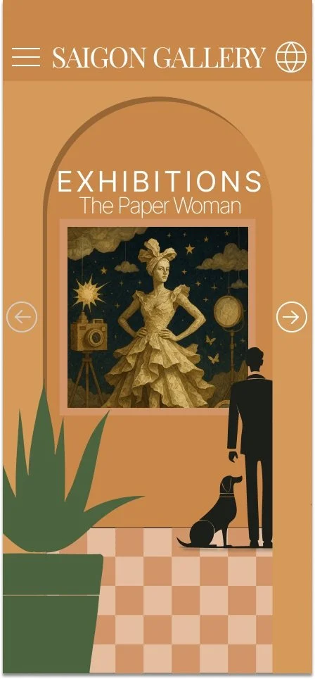
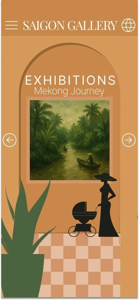
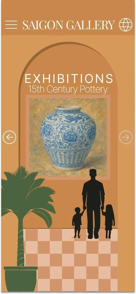
This project explores a mobile web app experience that allows visitors to:
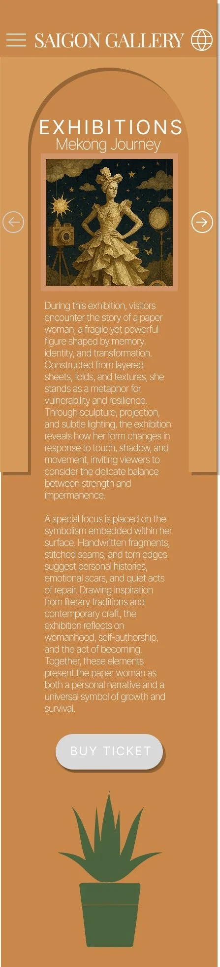
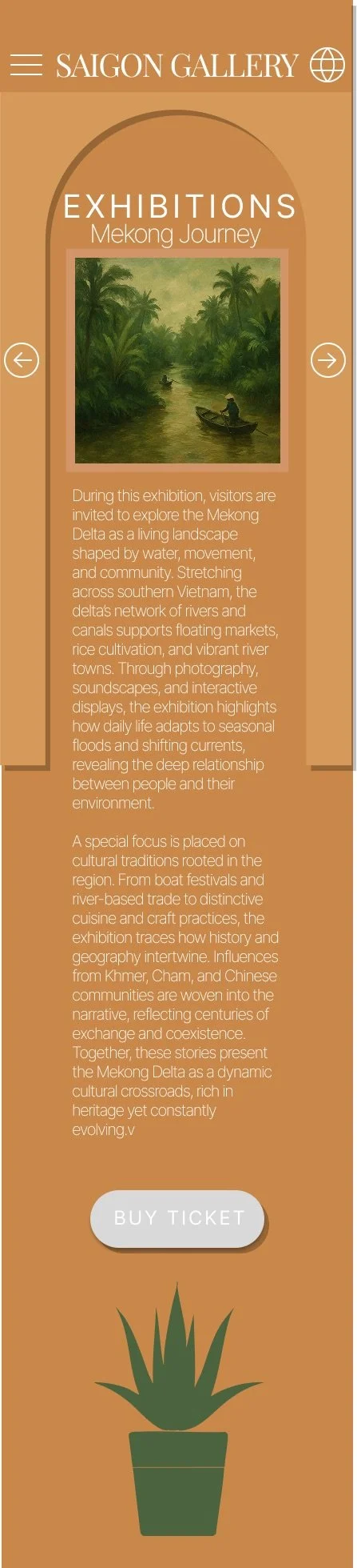
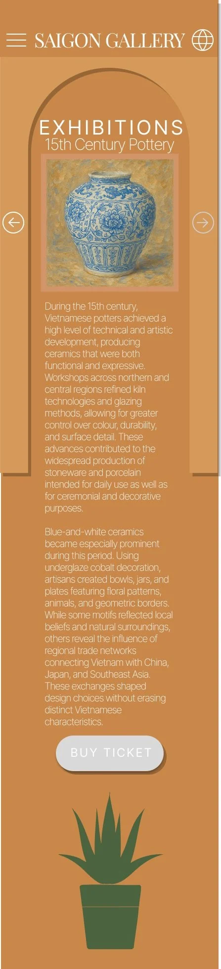
Discover current exhibitions
Purchase tickets in advance
Plan their visit easily
Designed to feel curated and cultural, not transactional.
Goals
Remove barriers to museum access by introducing mobile ticketing:
Design an intuitive user flow from discovery → purchase
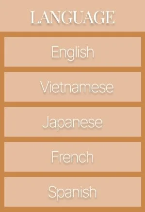
Ensure accessibility for both local and international visitors through clear navigation and multilingual support
Reflect the museum’s cultural identity through visual design
Translate the feeling of the museum’s architecture into the digital experience
Create a calm, immersive interface that helps users feel relaxed and excited to visit
Encourage visitors to slow down and engage with the art
Research & inspiration
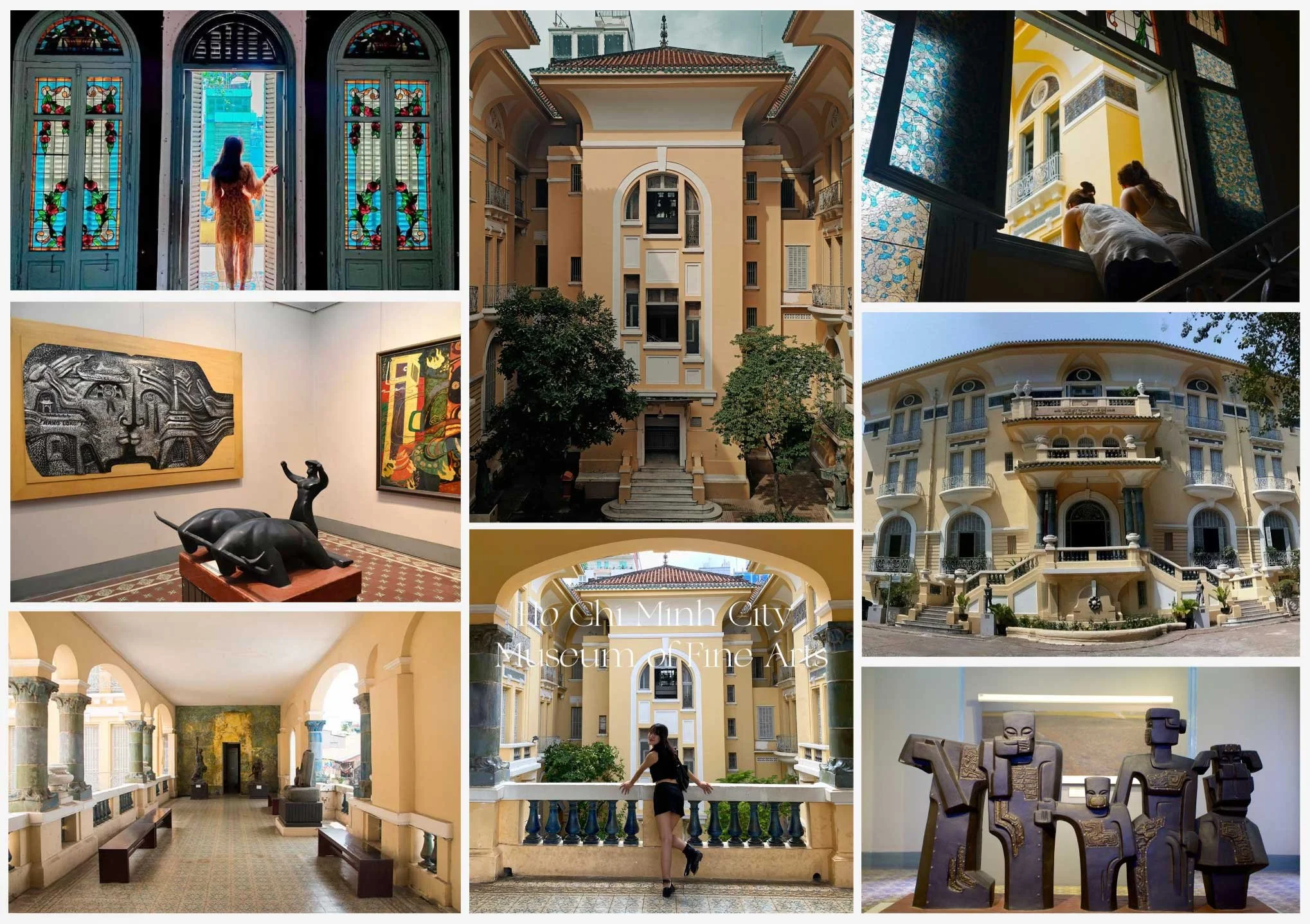
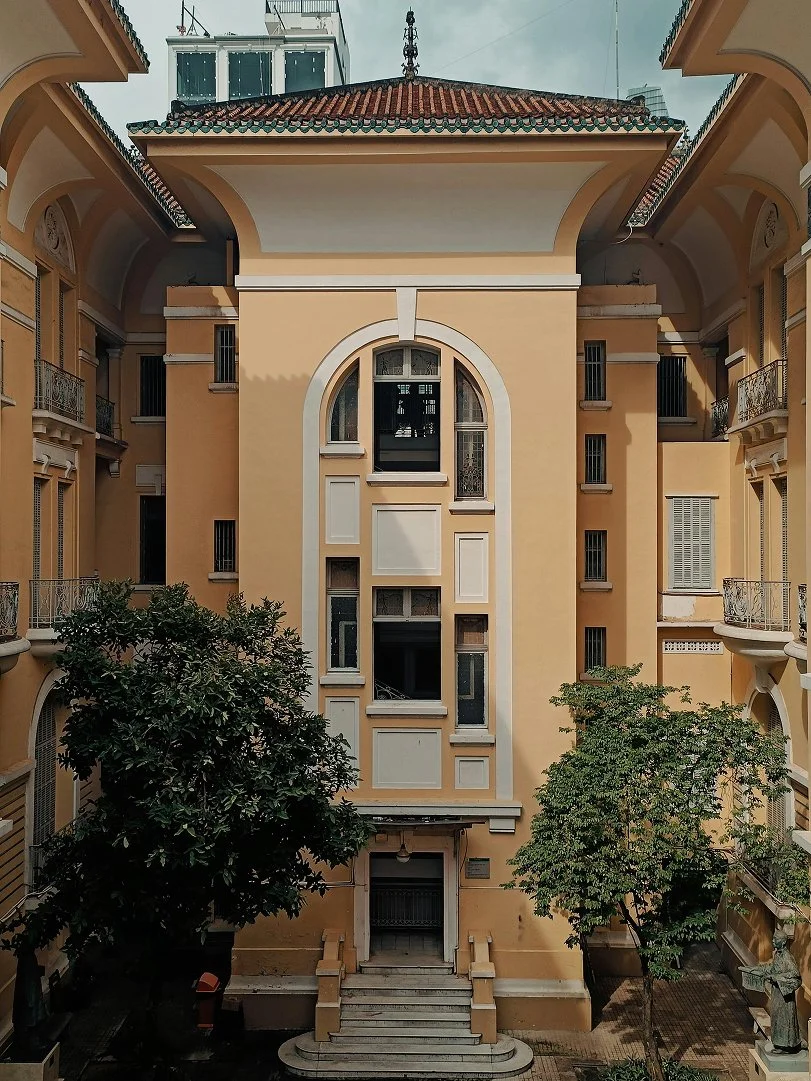
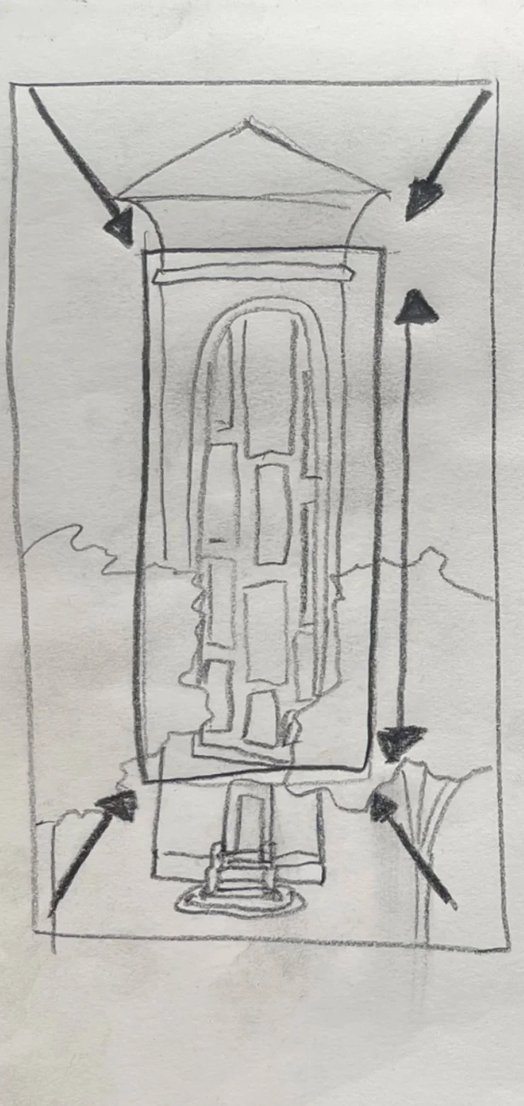
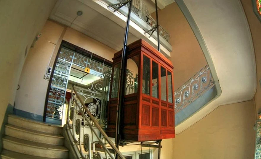
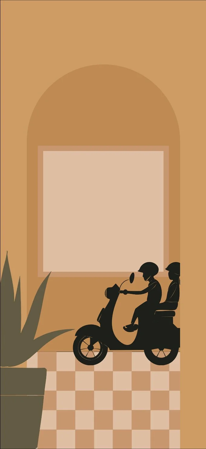
The museum’s architecture became a major source of visual influence for this project. A blend of 20th-century European design with an asian touch, the building feels expansive yet grounding, with bold colour washes that soothe visitors and invite them to slow down and pause. Rather than focusing on its origins, I was interested in how the space feels today and how people move through it.
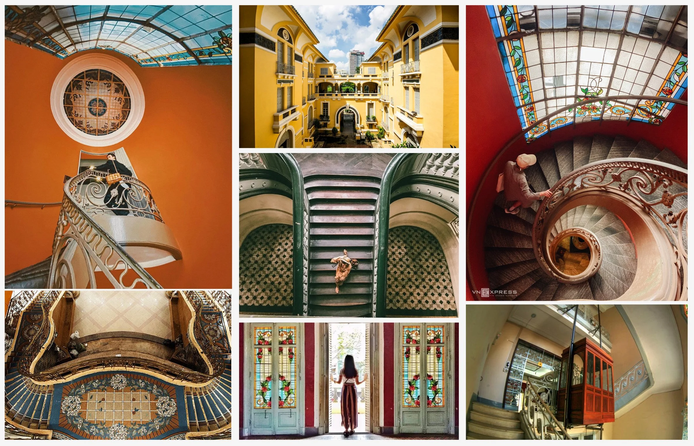
I was especially drawn to the geometry, symmetry, arches, and soft curves that guide movement naturally through the building. Details like stained glass, patterned floor tiles, and wrought iron balustrades add rhythm and texture, creating a calm, contemplative atmosphere. I wanted to translate this feeling into the digital experience, so users feel relaxed and emotionally ready to engage with the art before they arrive.
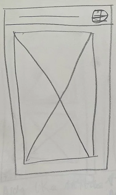
Initial Ideation - Low fidelity prototypes
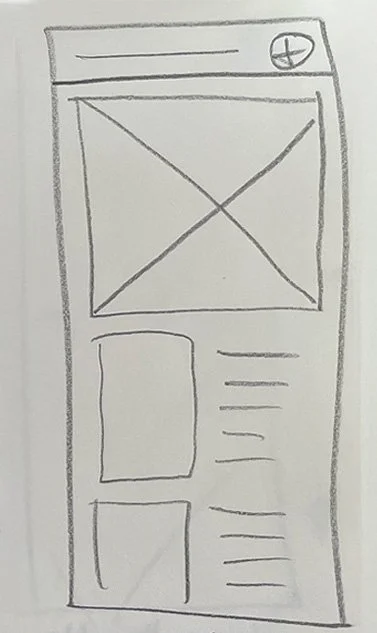
Initial thoughts, Full Screen Artwork or smaller artwork with text.
Arch like museum aesthetic, scrolling left to right, with a satisfying ‘ping/bounce’ centering it as you scroll.
Scroll through artwork like vinyl records in a shop.
Artwork could scroll vertically, to choose which exhibition you want to look at.
Sort of a birds eye of the gallery, from an angle and the user can swipe the tiles diagonally in either direction to pan around to remove one sculpture from view and bring in another. They can click a sculpture to visit the exhibition page. It’s got a slightly 00’s video game feel.
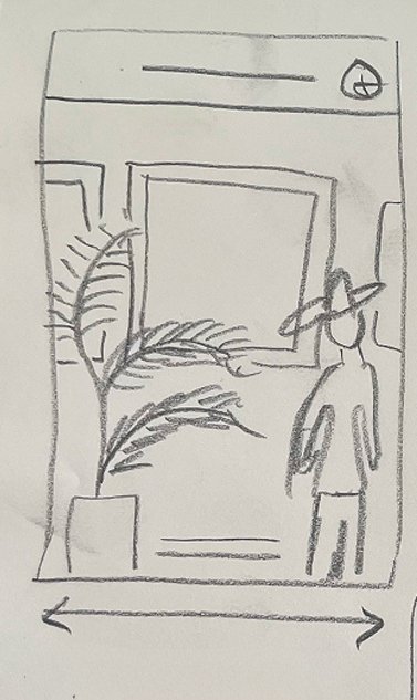
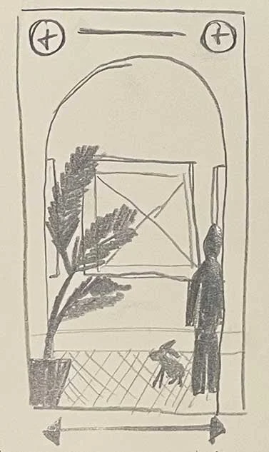
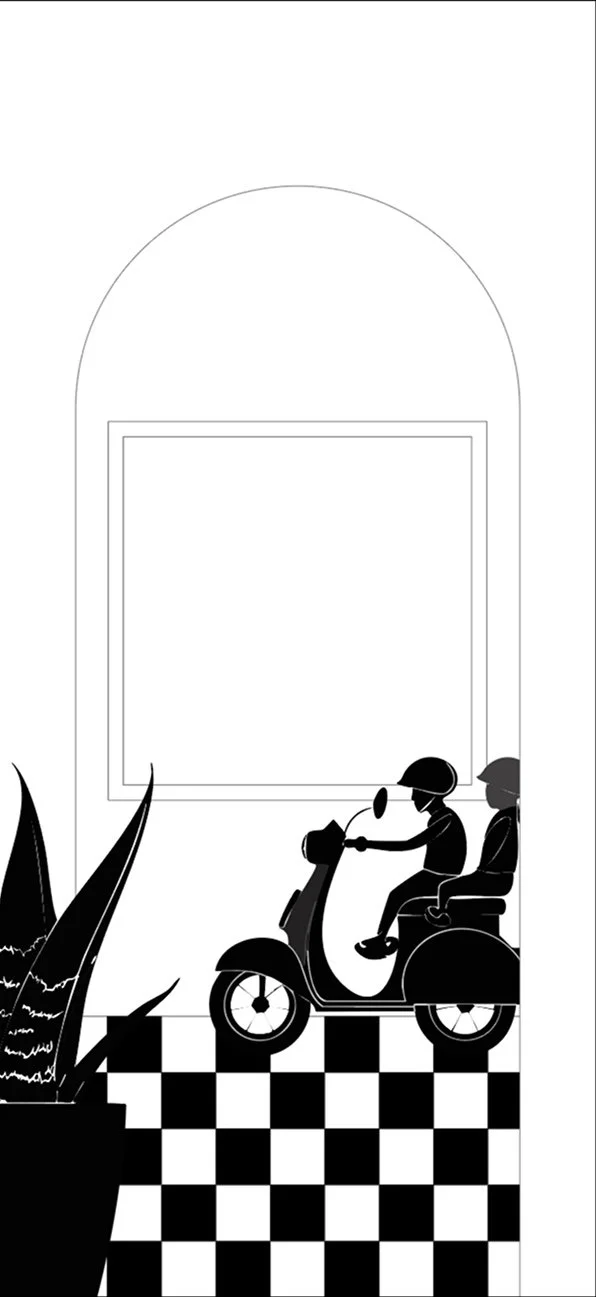
Bring in some characters and some decor such as plants which are around the gallery. As you swipe horizontally, the character and decor also move. Decor could also be sculptures? Thinking about using this to have multiple characters to show some diversity in who attends.
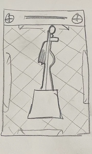
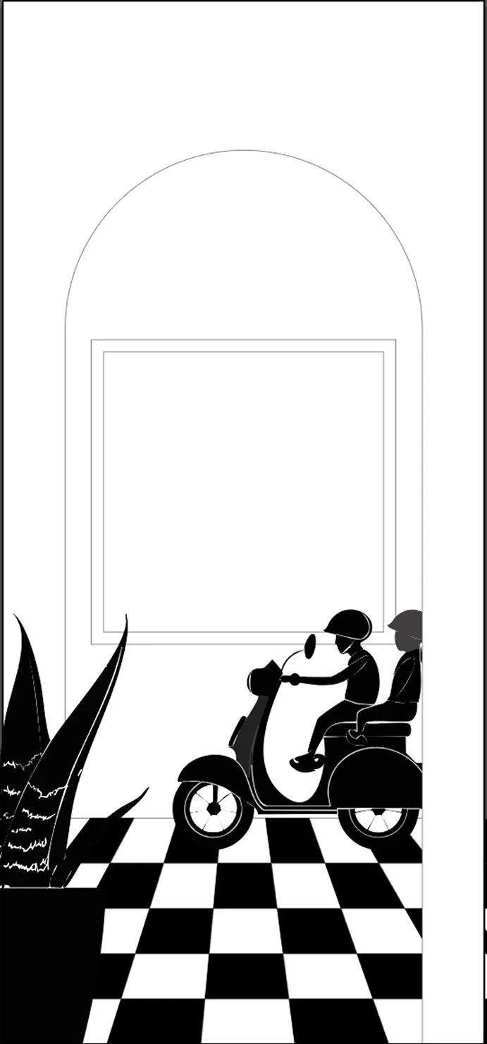
Bringing in a tiled floor, and an archway to bring in more of the specific site architecture to the idea
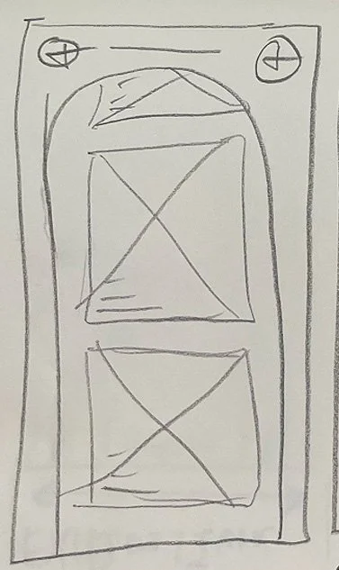
A tile border around the screen, Floor tile background, artworks can be scrolled vertically and be clicked to go to the exhibition page.
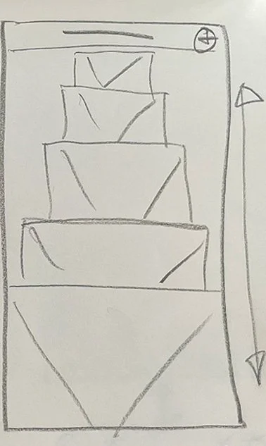
Home page / landing screen? Working with the courtyard entrance to the building, A scene which upon loading stars as a wide shot, with the ‘camera’ panning closer to the windows. Through the windows we can see the exhibitions. We can scroll the windows vertically to choose the exhibition to book.
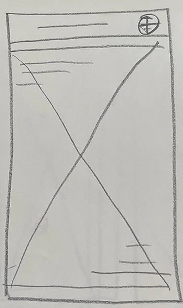
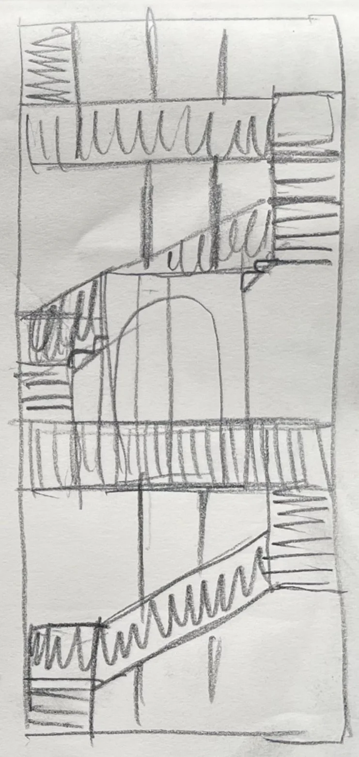
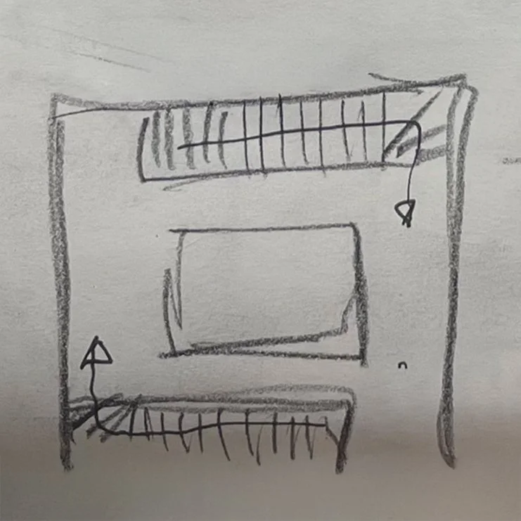
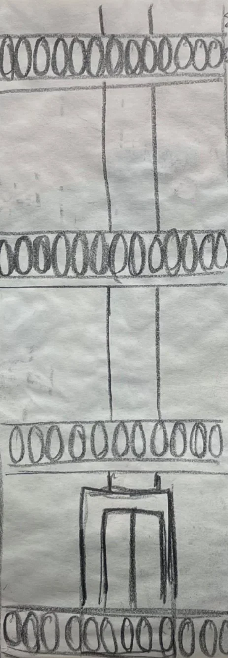
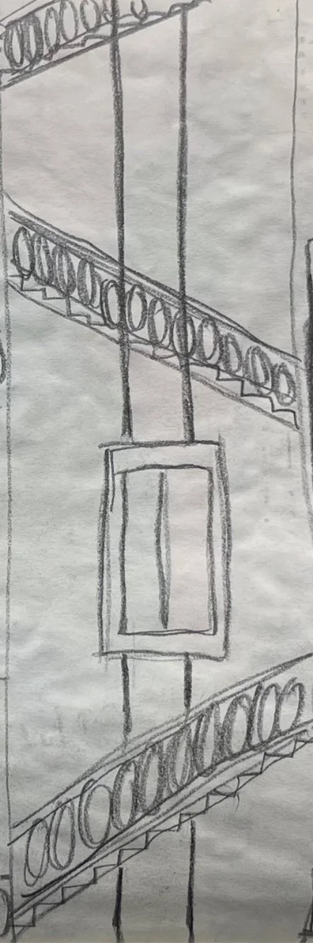
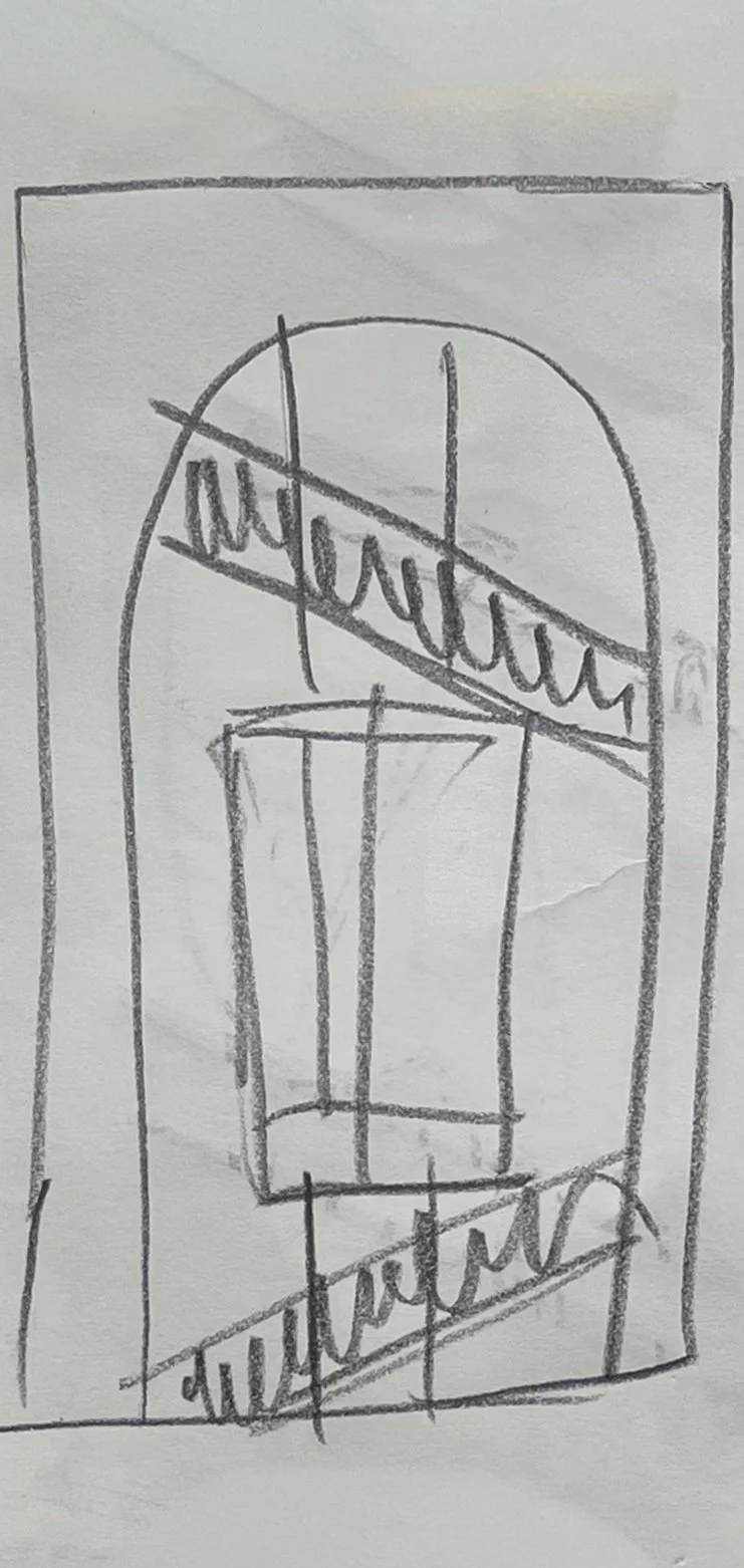
Thinking about how the stair and elevator page could work. What the layout would need to be to give a satisfying scroll that also visually still feels like the stairs
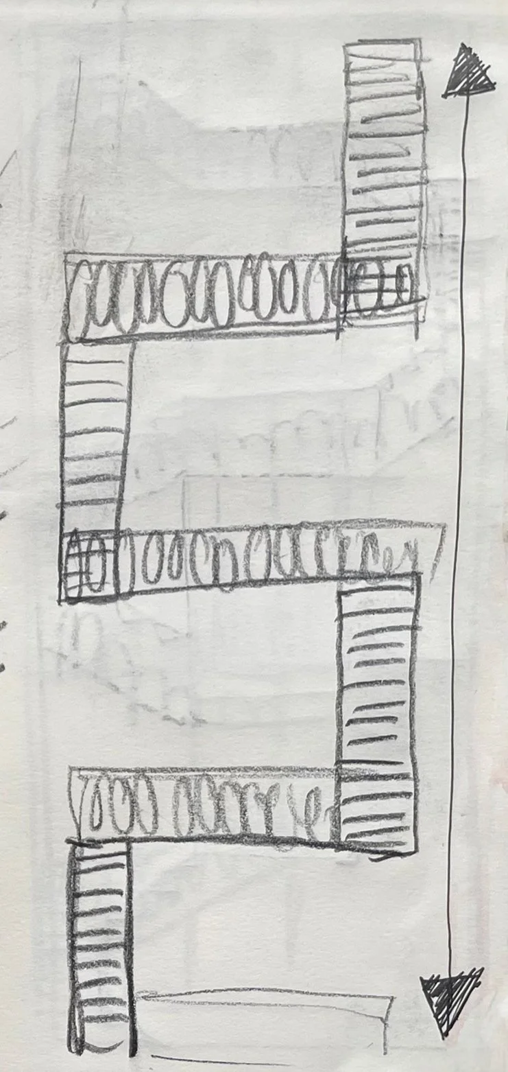
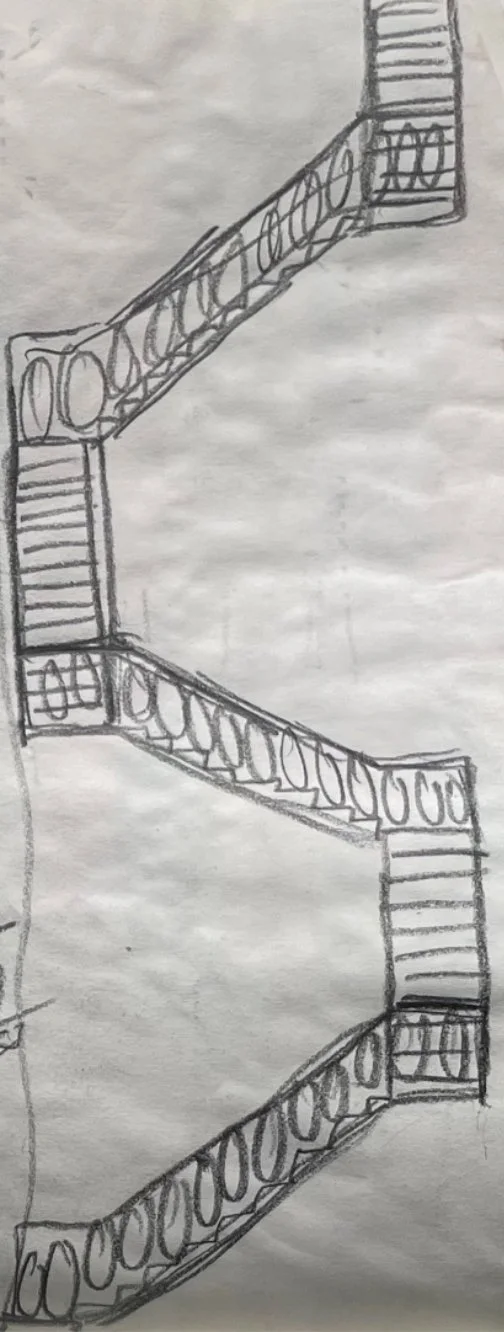
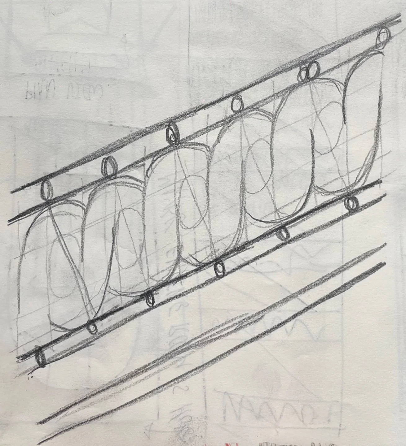
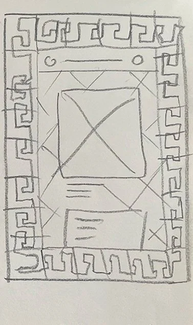
Linework study of the ballustrades, trying to simplify and understand how the ballustrade design would be translated to vector.
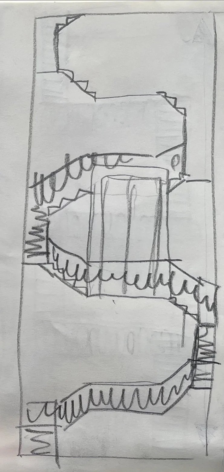
Alternative option, birds eye view - How would I make this movement work?
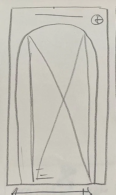
This is the final one I would like to try - Maybe it could be viewed through an archwork frame
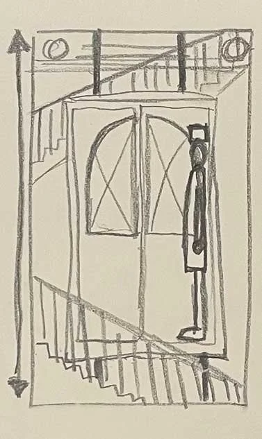
Looking at the elevator, having a scene in which the elevator visits different floors. Each different floor being a different scene, The elevator could stay in the middle of the screen, with the stairs moving vertically around it, to give the impression of it moving.
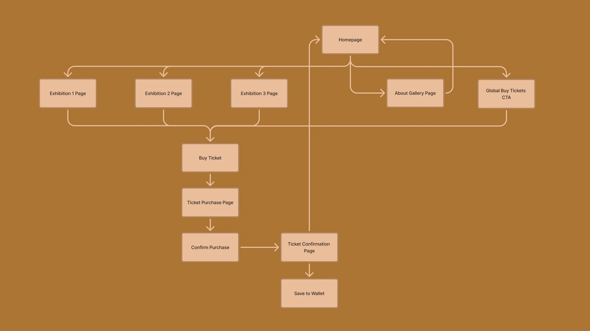
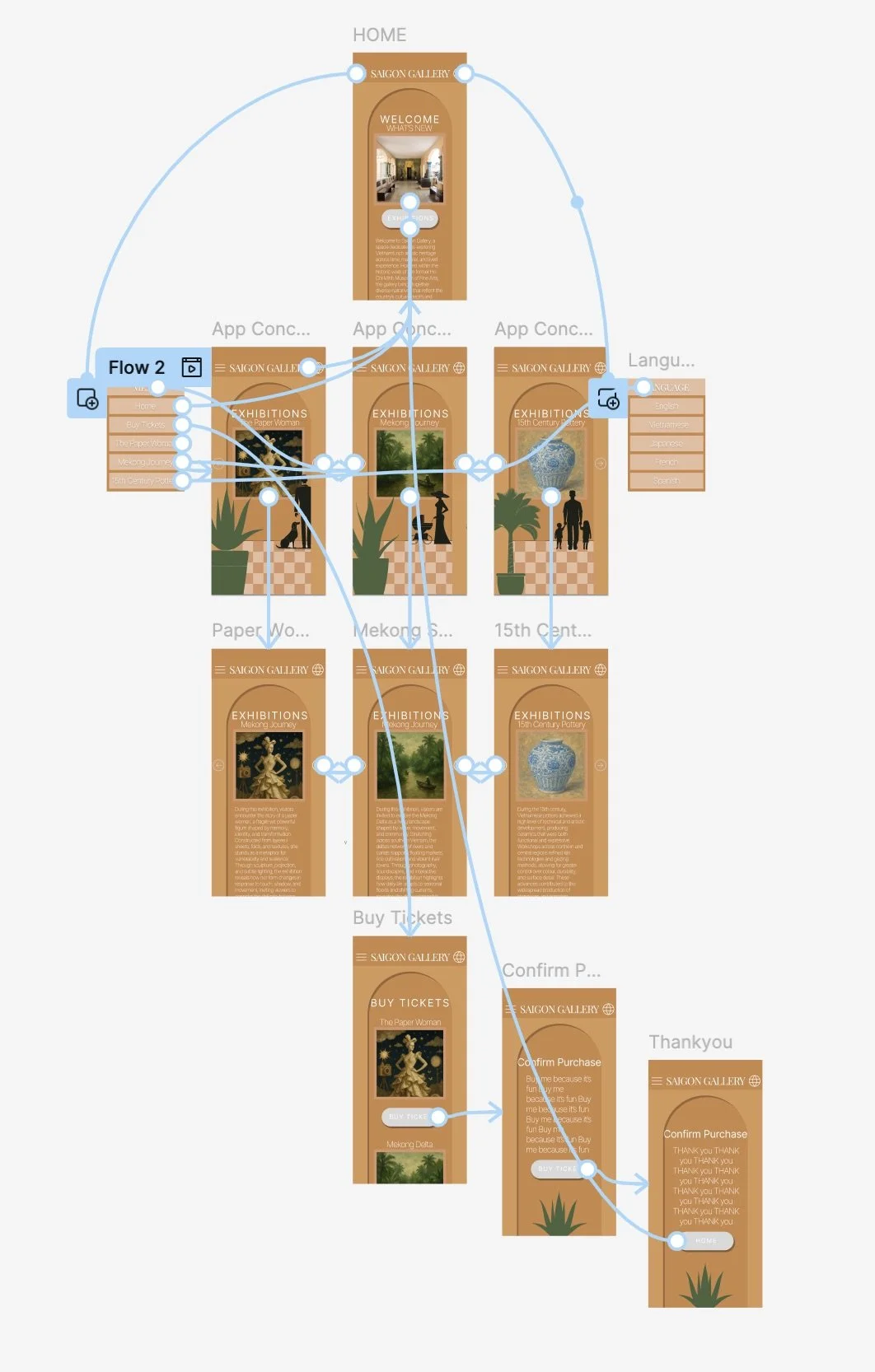
6. User flow
Biggest UX Challenge
As this was a self-initiated spec project, I wasn’t working with large-scale user data. Instead, I focused on design reasoning and small informal feedback loops.
The main challenge was balancing a chic, architecture-inspired aesthetic with practical usability. I wanted to reflect the character of the building through bespoke illustrations and subtle motion, while making sure the experience stayed:
Fast to use
Easy to understand
Accessible for users who already struggle with complex websites
Designing something that felt beautiful without becoming overdesigned was a constant tension.
Where users might hesitate
Based on heuristic review and informal feedback, potential hesitation points include:
Choosing the correct ticket type
Understanding which exhibitions are currently on
Feeling confident before checkout
Rather than assuming perfect clarity, I treated these as design risk areas and focused on:
Clear labels
Simple language
Visual hierarchy
Minimal steps
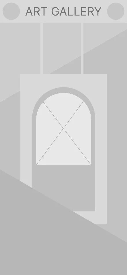
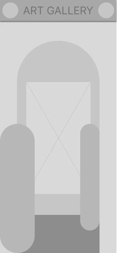
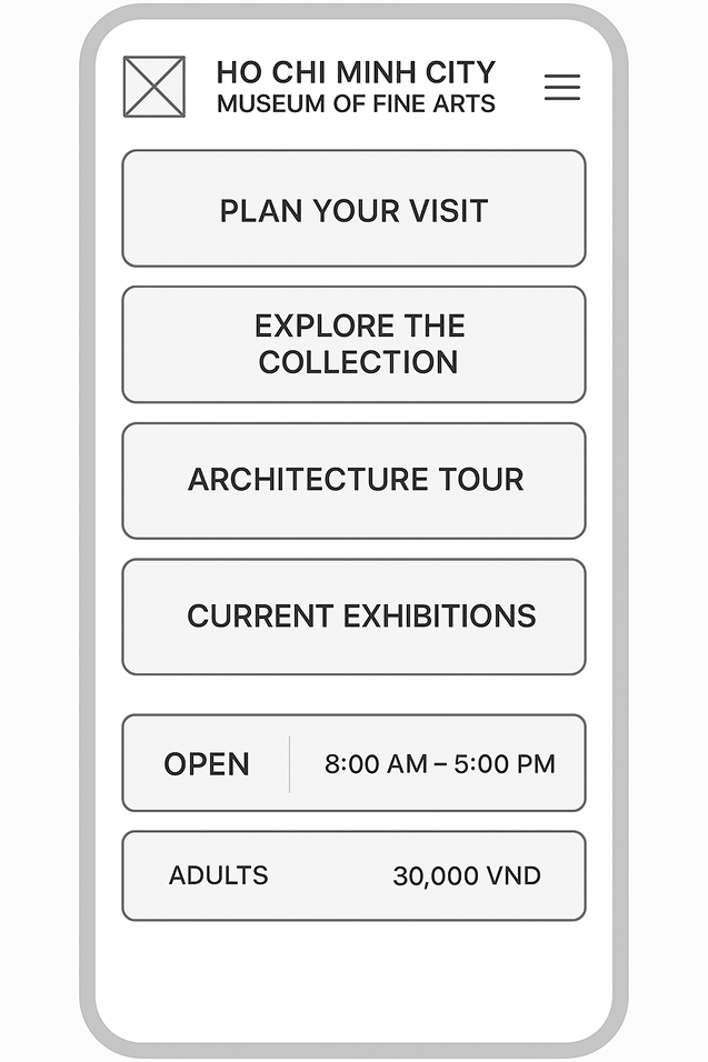
Medium Fidelity Wireframes
Having a look at how some of my ideas could translate into vector elements.
Visual design
Used some images in ‘Coolors’ to come up with an initial colour palette
AI test, Didn’t like the outcome.
Testing perspective for floor trials, before a colour test.
Motion test - The idea is the elevator feels like each time it’s stopped, it’s on a new floor. Each floor could represent an exhibition.
Motion test - Having several elements sweep across a screen, playing with the depth in the column from the arch.
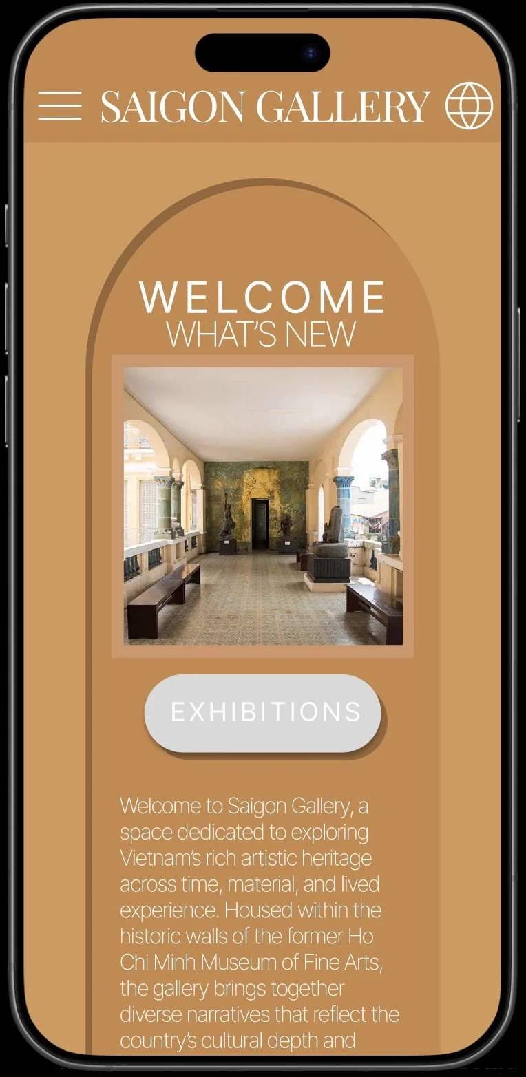
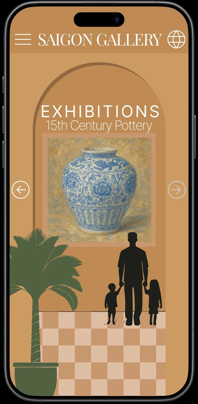
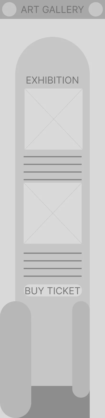
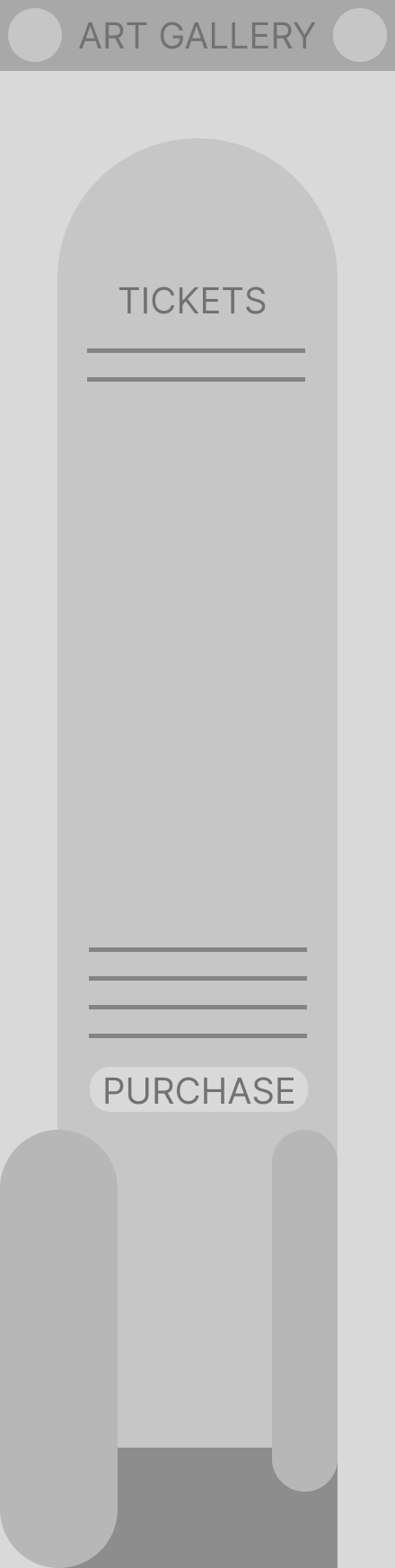
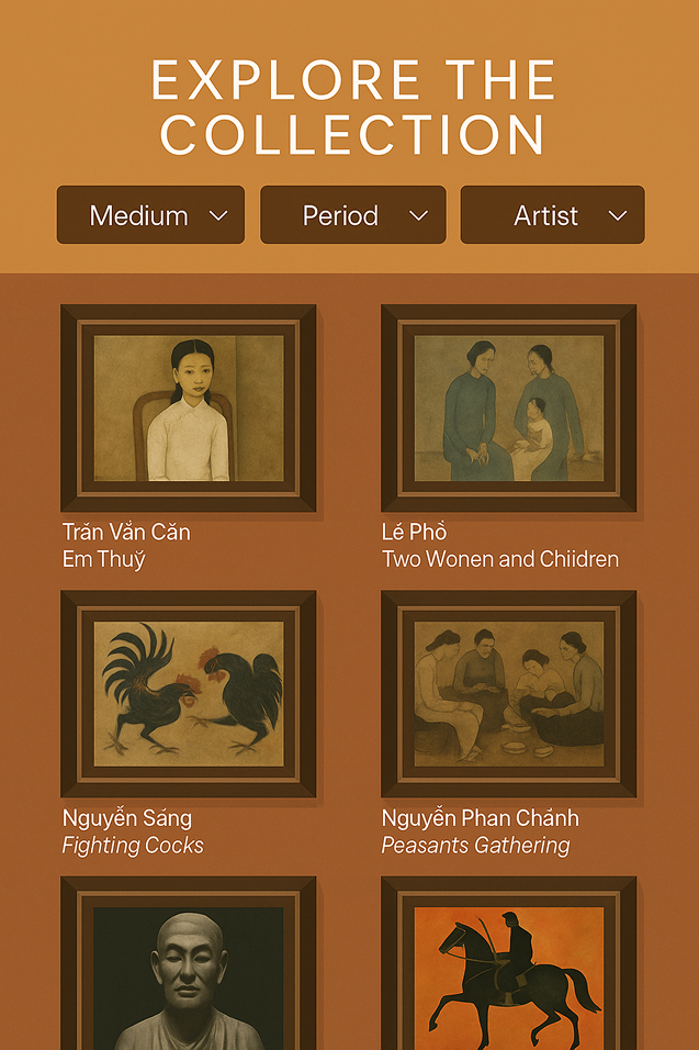
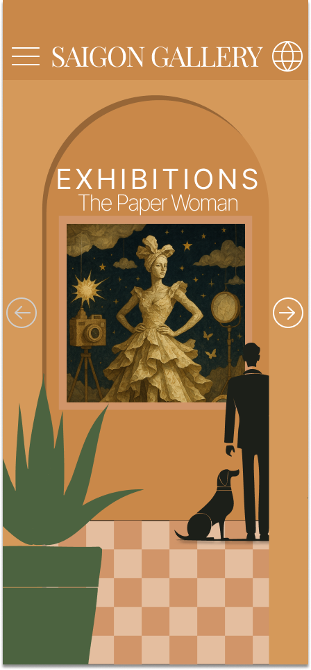
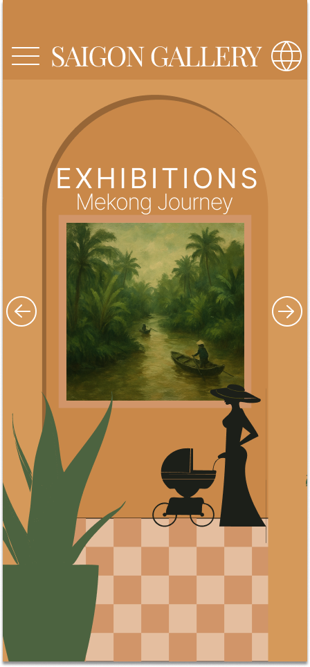
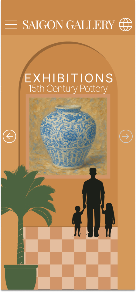
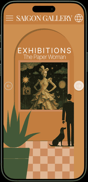
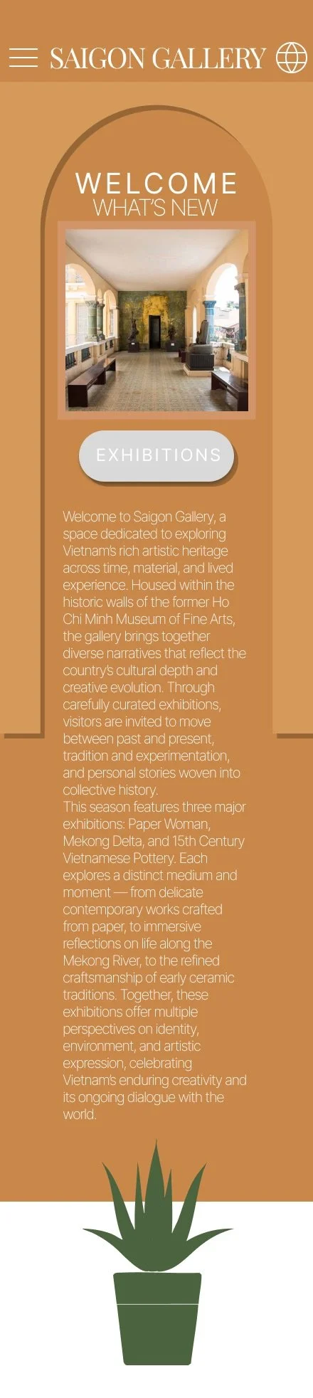
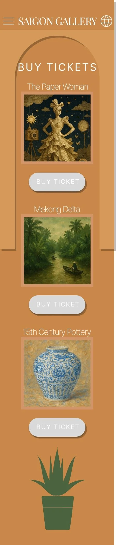
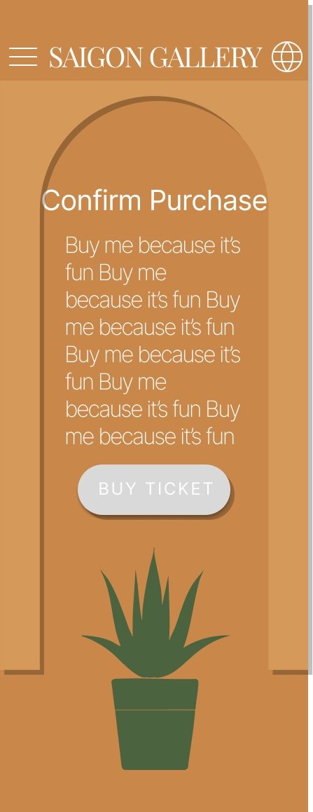
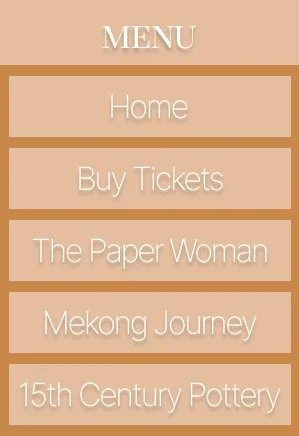
Final UI
Evaluation
This project was a fun and creatively rewarding experience. Designing for an art gallery allowed freedom to be playful with visual elements, layouts, and interactions. The cultural context encouraged a more expressive and image-led approach.
An early concept explored stairwell and elevator-inspired navigation. While visually interesting, it proved too convoluted for the intended users. Museum visitors require clear, intuitive navigation that supports quick understanding.
The final design prioritises simplicity without losing character. Expressive visuals are paired with a clear content structure to improve usability. This project reinforced the importance of balancing creativity with function in UX design.
Prototype (play with me)